In the 1920s, the world was obsessed with the machine. Typography reflected this through geometric giants like Futura font built on the cold, perfect logic of the circle and the square. But by 1988, legendary Swiss designer Adrian Frutiger felt something was missing. He wanted a “future” that felt less like a blueprint and more like a conversation. The result was Avenir, a typeface whose name is the French word for “future,” designed to bring a “humane” touch to geometric precision.
Today, Avenir is not just a font; it is a design institution. From the branding of the city of Amsterdam to the sleek interfaces of Apple’s iOS, it has become the gold standard for designers who want a look that is modern yet approachable. If you are looking to integrate this masterpiece into your workflow, you have to get it. The Avenir font download is available on the web, its various weights, and its technical formats is essential.
The Evolution of the “Future”
Avenir didn’t just stop in 1988. Over the decades, it evolved to meet the demands of digital screens and global communication. When you look for a download, you will likely encounter three primary versions:
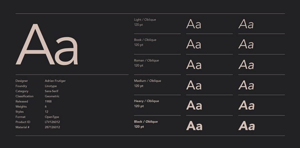
- Avenir (Original): The 1988 classic. It features subtle variations in stroke thickness that make it more legible than traditional geometric fonts. It was originally released with six weights.
- Avenir Next: Released in 2004, this was a collaboration between Frutiger and Akira Kobayashi. It was a massive expansion, adding condensed styles and a total of 24 styles to ensure it worked perfectly in the high-density world of digital UI/UX.
- Avenir Next World: The most recent iteration, designed for the global stage. It supports more than 150 languages, including Cyrillic, Greek, Hebrew, Arabic, and Thai, making it the ultimate tool for international branding.
Weights and Styles: Finding the Right Balance
One of the reasons Avenir is so beloved is its incredible range. Unlike many fonts that jump from “Thin” to “Bold” with nothing in between, Avenir offers a spectrum of weights that allow for precise typographic “color” on the page.
| Weight | Best Use Case |
| Light / Thin | Elegant headlines, high-end fashion branding, and minimalist posters. |
| Book / Roman | The “sweet spot” for long-form reading, such as body text in magazines or books. |
| Medium | Subheadings and emphasized text within a block of copy. |
| Heavy / Black | High-impact logos, call-to-action buttons, and signage that needs to be seen from a distance. |
The “Book” weight is particularly famous. Frutiger designed it to be slightly lighter than the “Roman” weight, specifically to handle the “ink spread” that occurred in traditional printing, ensuring the letters stayed crisp even on porous paper.
Formats and Technical Compatibility
When you proceed with an Avenir download, the file format you choose depends entirely on your project. Modern systems and software have unified much of this, but nuances remain.
- OpenType (.OTF): This is the industry standard for designers. It supports advanced features like ligatures, small caps, and “old style” figures. If you are using Adobe Creative Cloud or Figma, this is the format you want.
- TrueType (.TTF): Often used for standard office applications and older Windows environments. It is highly compatible but sometimes lacks the advanced typographic features of OTF.
- WOFF / WOFF2: These are compressed formats specifically for web use. If you are a developer looking to use Avenir on a website, you will need these files to ensure fast loading times without sacrificing style.
How to Get Avenir: Licensing and Legal Downloads
Because Avenir is a premium, professional typeface owned by Monotype (via Linotype), it is rarely “free” for commercial use. However, there are several legal ways to access it:
Pre-installed System Fonts
If you are a Mac user, you likely already have Avenir installed on your mac. Apple has bundled these fonts with macOS since 2012. You can use these for personal projects and even some commercial print work, provided you aren’t distributing the font files themselves.
Commercial Foundries
For full commercial rights, especially for logos, web embedding, or mobile apps, you should purchase a license from official distributors. A single weight typically starts around $40, while the full family can be a significant investment for a design agency.
Subscription Services
Many designers access Avenir through a Monotype Fonts subscription, which provides access to thousands of high-end typefaces for a monthly fee. This is often the most cost-effective way for freelancers to stay legal while using premium typography.
Best Use Cases for Avenir
Where does Avenir truly shine? Its versatility means it’s rarely a “bad” choice, but it excels in three specific areas:
Corporate Identity and Branding
Avenir strikes a perfect balance between “trustworthy” and “innovative.” It doesn’t feel as corporate as Helvetica, nor as “techy” as more modern geometric fonts. This makes it ideal for banks, tech startups, and lifestyle brands.
User Interface (UI) Design
Thanks to the refinements in Avenir Next, the font is incredibly legible on mobile screens. Its open counters (the holes in letters like ‘e’ and ‘a’) prevent it from looking like a blurry mess at small sizes, which is why it’s a favorite for app developers.
Wayfinding and Signage
The “Heavy” and “Black” weights are robust and highly visible. Because the letters are based on clear geometric shapes, they are easy to read at a glance, making Avenir a popular choice for airport signage and city wayfinding systems.
The Verdict
Avenir is the “Goldilocks” of the font world: not too cold, not too soft, but just right. It takes the best of the 20th century’s geometric experiments and adds a layer of 21st-century humanism. Whether you are downloading it for a minimalist resume or a global rebranding project, Avenir ensures your message looks like the future, one that is bright, clear, and undeniably human.