The Screen Size Problem That Costs Businesses Real Money
A website that is beautiful on a designer’s 27 inch monitor can be completely unusable on a five inch phone screen. Buttons overlap, text is reduced to unreadable sizes, navigation menus are crunched into chaos and images overflow their containers. This is not some hypothetical scenario. It happens every single day to businesses that put websites up without doing thorough research to determine how their layouts play on the enormous variety of devices people actually use. According to research, it has consistently been found that more than 73% of web designers nominate non responsive design as the number one reason for visitors abandoning a site altogether. Those abandonments are a direct conversion to lost revenue, broken brand image, and wasted marketing dollars that drive traffic to the pages that frustrate instead of converting. The lack of awareness is not the challenge. Most development teams know that responsive design is important. The real difficulty is the sheer number of screen sizes, operating systems, browsers and device orientations that exist out in the real world – and manual verification of all of them is practically impossible.
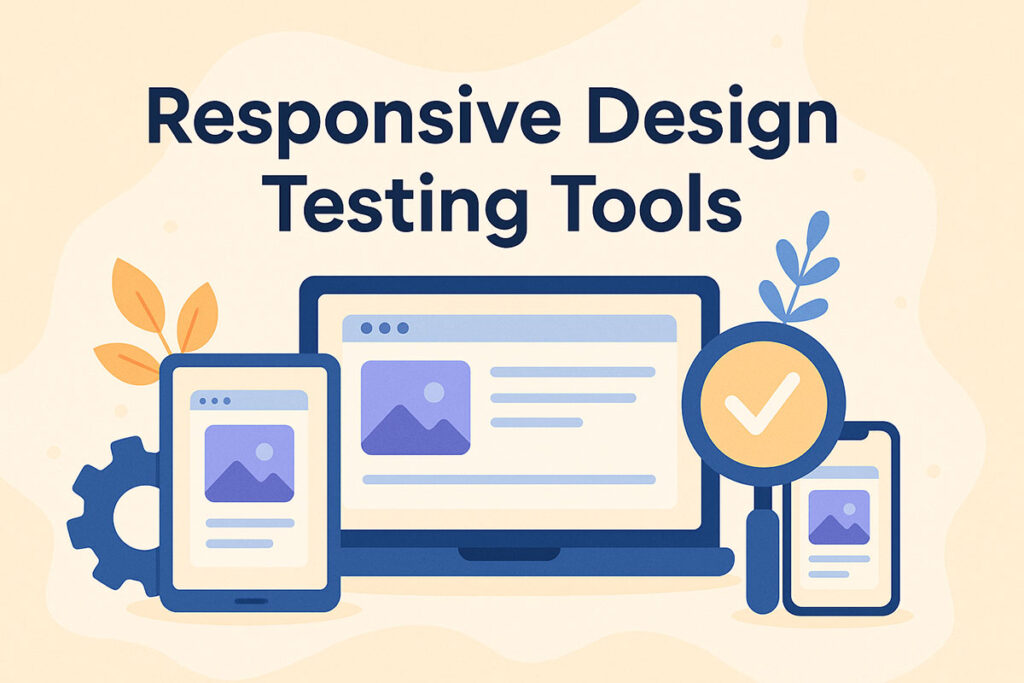
What These Tools Actually Do Behind the Scenes
Responsive testing tools solve this problem by allowing teams to preview, validate, and automate layout checks across hundreds of device and browser combinations from a single platform. Some tools such as Google Chrome Developer Tools provide basic device emulation directly inside the browser which is good for quick checks during the development phase but not deep enough to provide the necessary validation. Cloud based platforms like BrowserStack and LambdaTest help get access to real devices and also allows testing simultaneously on dozens of different viewports where inconsistencies might go unnoticed by emulators. Framework based options like TestCafe provide the developers with programmatic control over cross browser end to end testing along with parallel execution capabilities.
TestSigma however does things differently by integrating AI based codeless automation with the availability of more than 3000 actual device and browser combinations allowing teams to implement visual layout checks, automatically detect UI breakages and inject their results directly into their continuous integration pipelines. The generative AI capabilities on the platform enable testers to be able to create responsive validation scripts using plain English as opposed to code, meaning that quality assurance professionals without deep programming backgrounds can make a meaningful contribution to the testing process.
Beyond Aesthetics and Into Business Impact
Checking website responsiveness is not merely about making things look pretty on different screens. Search engines such as Google have switched to mobile first indexing, which means a mobile experience of a site directly affects a site’s ranking in search results. A poorly responsive website does not merely irritate the visitors. It becomes more difficult to find in the first place. Conversion rates decrease measurably if interactive features such as buttons and form fields are too small to comfortably tap on touchscreens. Content readability is also negatively impacted when line lengths, spacing and font sizes do not adapt to smaller displays. When the menus that are designed to be used with the mouse cursor do not allow finger use, navigation turns into a matter of patience.
Making Responsiveness a Habit Rather Than an Afterthought
The most successful teams consider responsive testing as an ongoing exercise integrated in all development sprints and not as a check box that a project needs to pass before it goes live. Automated tools ensure that this is sustainable, by catching layout regressions the moment that they occur; long before they are experienced by a real user. This consistency is what eventually makes the difference between good digital experiences and bad ones.


