Your outfit speaks before you do. Literally. Before you’ve said a word in that meeting, shaken a hand, or pulled up your slides, color has already done the talking. Research confirms that employees in strategically color-optimized environments can experience up to a 15% increase in productivity compared to poorly designed spaces. That finding applies just as much to what you put on your body as it does to the walls around you. Master business fashion color coordination, and you’ll change not only how people see you but how you walk into a room.
The Power of Business Fashion Color Coordination for a Professional Image
Here’s something most professionals never quite clock: color is always working in the background. Every shade communicates something about authority, warmth, focus, and calm without a single word exchanged.
Why Color Choices Matter More Than You Think
Navy signals reliability. Grey reads as measured and composed. Red grabs attention fast, but lean on it too hard, and it tips into aggression. These aren’t arbitrary associations. They’re deeply conditioned responses, and understanding them is just smart dressing, not overthinking.
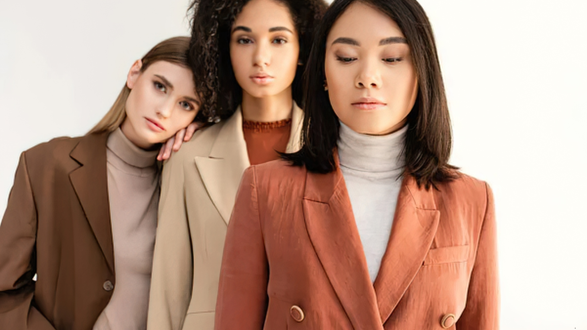
Exploring a curated edit of women’s business outfits at Luna Fashion House is a great place to see intentional color in action, tailored blazers, structured two-piece sets, and carefully considered palettes that do exactly this kind of quiet, powerful work.
Common Color Mistakes to Avoid
Clashing tones. Head-to-toe dull beige. Five competing accent colors are fighting for the eye’s attention. Sound familiar? These are the usual suspects. And there’s data behind the concern, too. Research highlights that overly neutral or monotonous color palettes actively contribute to feelings of fatigue and boredom inprofessional settings. Balance isn’t optional. It’s strategic.
So now you understand the *why*. Let’s move to the *how* because once you understand what color is doing under the surface, using it intentionally becomes second nature.
Essential Color Pairing Principles in Office Outfit Color Strategies
Theory is useful right up until you need to get dressed on a Tuesday morning. Here’s where principle meets practice and where your wardrobe decisions start compounding in the right direction.
Building a Business Attire Color Guide: Core Neutrals and Versatile Hues
Think of your neutral base as your wardrobe’s infrastructure. Navy, black, grey, white, camel, and taupe. These are the load-bearing walls of any credible business attire color guide. Get these right, and everything else becomes easier.
Accent colors are where personality lives. Burgundy, emerald, blush, muted teal, chosen thoughtfully, these shades add dimension without hijacking the whole look. One or two accents per outfit is typically plenty. More than that, and you’re competing with yourself.
Once your neutral foundation is established, the next challenge is keeping things fresh across the calendar year without rebuilding from zero every few months.
Seasonal Color Matching: Adjusting Palettes Throughout the Year
Spring and summer favor soft pastels, clean whites, and airy neutrals. They feel current without sacrificing polish. Come autumn and winter, jewel tones earn their moment: deep plum, forest green, chocolate brown. Rich, grounded, and effortlessly professional.
The real trick? Transitioning seasonally without a full closet overhaul. Swap a blush blouse for wine. Trade white linen for ivory wool. Tiny substitutions. Genuinely big impact.
Knowing which colors belong to which season is one thing. Knowing how to actually combine them into a cohesive, deliberate outfit that’s where the real skill lives.
Creating Color Harmony: Classic and Modern Combinations
Monochromatic dressing has a reputation for a reason. A head-to-toe tonal grey outfit communicates quiet confidence. No noise. Just composure.
Analogous pairings, navy and teal, camel and ivory, offer visual interest without any real risk. And if you want a stronger statement, try a single color pop against a neutral ground: cobalt bag, charcoal suit. It lands hard without looking chaotic.
Professional Color Matching Tips for Every Workplace Setting
Now that the pairing principles are locked in, it’s time to apply them where it actually counts in the specific context of your workplace culture and dress code.
Corporate Formal: Timeless Combos for Boardrooms
High-stakes environments demand intentional restraint. Navy, charcoal, or deep grey suiting paired with white or pale blue signals authority without effort. A silk scarf in a muted jewel tone, or cognac leather heels, these details elevate the whole picture without distracting from it.
Every color element should earn its place. That’s the rule. If you can’t justify why it’s there, it probably shouldn’t be.
While formal environments call for precision, business casual settings open up a bit more room to play, and that’s where things get genuinely interesting.
Business Casual: Flexible Palettes for Polished Looks
This is honestly where professional color-matching tips deliver their best return. A well-fitted camel blazer over a dusty rose blouse with dark trousers? Polished, personality-forward, and completely appropriate.
Fine pinstripes and muted florals work well here, too. Color-blocking, pairing two distinct, complementary blocks, can feel modern without sliding into casual. It’s a sharper look than most people expect.
Of course, not every professional day happens in a physical office anymore. Your color strategy needs to hold up on screen just as well as it does in person.
Remote Work and Hybrid Offices: Digital-Friendly Colors
On camera, mid-tones are your friend: navy, dusty blue, soft green, warm white. They photograph cleanly and read as polished. Bright white creates glare. Neon tones distort. Very dark shades lose detail under most lighting setups.
As a core part of any solid office outfit color strategies approach, keep a dedicated mental (or physical) edit of camera-ready tops. A deliberate, screen-friendly choice makes every video call look intentional rather than improvised.
Your Color Coordination Questions, Answered
Can bold colors be professional for office settings?
Yes, context is everything. A bold cobalt blazer over neutral trousers reads as confident, not chaotic. The key is anchoring bold pieces with understated basics and keeping the statement to one item per look.
What accent colors work best for deeper skin tones in business fashion?
Rich jewel tones, emerald, cobalt, deep plum, and burnt orange tend to be excellent choices. Gold-adjacent neutrals like camel and warm ivory also complement beautifully without washing anything out.
Is it okay to wear all black to the office?
Absolutely. Many professionals do it brilliantly. Play with texture matte versus satin, wool versus leather, or introduce a single warm accessory like a tan belt or gold jewelry to prevent the look from feeling flat or heavy.
Final Thoughts on Dressing With Color Confidence at Work
Intentional color is one of the most underused professional tools available to you. A genuine working knowledge of how to match colors for work from your neutral foundation to seasonal transitions and camera-optimized hues changes how others read you.
More than that, it changes how you carry yourself. Start with what you already own. Audit your closet honestly, name the gaps, and build deliberately from there. Great business fashion color coordination has nothing to do with spending more. It has everything to do with dressing with purpose every single day, in every single room.