Most homes rely on neutral walls. White. Beige. Light gray. These colors feel safe and easy to decorate around. They also appear in thousands of homes, which makes many interiors look similar.
Many designers now turn to blue wallpaper when they want to add personality without overwhelming a space. Blue introduces color while still feeling calm and balanced. It can make a room look sophisticated, relaxed, or even dramatic depending on the shade.
Blue also connects naturally with the sky and water. That connection often makes interiors feel open and peaceful. Many homeowners choose blue walls because the color creates a sense of calm and stability in living spaces.
This guide explains how blue wallpaper works in interior design. It covers color psychology, design strategies, and practical tips for creating beautiful rooms with blue walls.
Why Blue Is One of the Most Popular Colors in Interior Design
Blue remains one of the most widely used colors in home design.
The reason is simple. Blue works in almost every type of room.
The color is associated with several positive emotions:
- calmness
- trust
- stability
- serenity
These emotional associations make blue ideal for spaces where people relax or focus.
Blue can also affect how people physically feel inside a room. Studies of color psychology suggest that blue tones can lower stress and create a peaceful atmosphere.
Because of this calming effect, designers frequently use blue in:
- bedrooms
- bathrooms
- living rooms
- home offices
Blue wallpaper helps create environments that feel comfortable and welcoming.
How Different Shades of Blue Change a Room
Not all blue shades create the same effect.
The tone you choose influences the entire mood of the room.
Light Blue
Light blues create bright and airy spaces.
Common examples include:
- sky blue
- powder blue
- pale aqua
These shades reflect light and make rooms feel larger.
Interior designers often use light blue in:
- small bedrooms
- bathrooms
- apartments with limited natural light
Lighter shades help create a peaceful environment that encourages relaxation.
Mid-Tone Blues
Mid-tone blues balance calmness with depth.
Examples include:
- denim blue
- slate blue
- steel blue
These colors feel comfortable and versatile.
They work especially well in:
- living rooms
- family rooms
- home offices
Mid-tone blues also support focus and mental clarity, which makes them useful in workspaces.
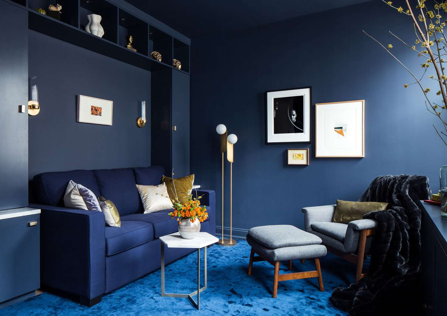
Dark Blue
Dark blues add sophistication and drama.
Popular examples include:
- navy
- indigo
- royal blue
These shades create depth and contrast. They can make a room feel luxurious and elegant.
Designers often use darker blues in:
- dining rooms
- libraries
- statement walls
When paired with good lighting, dark blue walls look rich rather than heavy.
Why Wallpaper Works Better Than Paint
Paint creates a solid color surface.
Wallpaper adds dimension.
Blue wallpaper often includes additional design features:
- textured finishes
- botanical patterns
- geometric prints
- metallic accents
These details make the walls visually interesting.
Texture also reflects light differently from flat paint, which adds depth to the room.
Wallpaper can turn a simple wall into a design centerpiece.
Best Rooms for Blue Wallpaper
Blue works well in many areas of the home.
Certain spaces benefit especially from its calming qualities.
Bedrooms
Bedrooms should feel relaxing.
Blue walls support restful sleep and emotional calm.
Light or muted blues often create the best effect.
Designers commonly combine blue wallpaper with:
- white bedding
- natural wood furniture
- soft lighting
These elements reinforce the peaceful atmosphere.
Living Rooms
Living rooms serve as gathering spaces.
Blue walls help create a balanced environment that feels both social and comfortable.
Mid-tone or darker blues work well in living rooms because they anchor the room visually.
Pair blue wallpaper with:
- neutral sofas
- textured rugs
- metallic accents
These combinations create a layered design.
Bathrooms
Blue feels especially natural in bathrooms.
The color connects visually with water, which enhances the spa-like atmosphere.
Common wallpaper choices include:
- soft aqua tones
- marine-inspired prints
- coastal patterns
These designs reinforce a clean and refreshing environment.
Home Offices
Many people work from home now.
Color can influence productivity.
Muted blue tones support focus and concentration without feeling overwhelming.
A blue wallpaper accent wall behind a desk can improve both the look and functionality of a workspace.
How Blue Wallpaper Changes Room Size Perception
Color affects how people perceive space.
Blue tones visually recede. That means the color appears to move away from the viewer.
This optical effect can make rooms feel larger and more open.
Small spaces benefit from this effect.
Light blue wallpaper can make compact rooms feel airy instead of cramped.
Color Combinations That Work With Blue Wallpaper
Blue pairs well with many other colors.
Certain combinations appear especially elegant.
Blue and White
This is the most classic pairing.
White balances blue and keeps the room bright.
Common design combinations include:
- navy wallpaper with white furniture
- pale blue walls with white trim
- blue patterned wallpaper with white bedding
The result feels clean and timeless.
Blue and Natural Wood
Wood tones warm up cool blue colors.
Light woods such as oak and maple create contrast without feeling harsh.
Common pairings include:
- blue walls with wooden furniture
- blue wallpaper behind floating wood shelves
- blue dining rooms with wooden tables
This combination creates a natural and inviting atmosphere.
Blue and Gold
Gold accents add luxury.
Designers often pair dark blue wallpaper with:
- brass lighting fixtures
- gold picture frames
- metallic mirrors
This combination appears frequently in upscale interiors.
Blue and Gray
Gray softens blue tones.
The combination creates a modern and understated palette.
This pairing works well in:
- contemporary apartments
- minimalist homes
- modern offices
Accent Walls vs Full Blue Rooms
Blue wallpaper can appear in two ways.
Accent walls. Or full-room coverage.
Accent Walls
Accent walls introduce color without overwhelming the room.
Popular placements include:
- behind a bed
- behind a sofa
- behind a dining table
This approach works well for people experimenting with color.
Full Blue Rooms
Some homeowners choose to cover all walls in blue wallpaper.
This approach creates an immersive environment.
It works especially well in:
- dining rooms
- powder rooms
- reading rooms
These spaces benefit from a strong atmosphere.
Lighting Tips for Blue Wallpaper
Lighting strongly affects how blue appears.
Warm lighting makes blue tones feel cozy.
Cool lighting emphasizes crispness and clarity.
Good lighting options include:
- wall sconces
- floor lamps
- pendant lighting
- recessed ceiling lights
Mirrors can also reflect light and prevent dark blues from feeling heavy.
Decorating Around Blue Wallpaper
Furniture and decor should balance the color.
Designers often recommend:
- neutral sofas
- light rugs
- soft textiles
- artwork with complementary colors
Plants also work beautifully with blue walls.
Green leaves contrast naturally with blue backgrounds.
This combination creates a fresh and natural look.
Why Designers Continue to Choose Blue
Blue remains a timeless interior design color.
Trends come and go. Blue stays relevant.
The color works in both traditional and modern spaces.
Blue can feel:
- coastal
- contemporary
- classic
- luxurious
Few colors offer that level of versatility.
Final Thoughts
blue wallpaper offers one of the easiest ways to transform a room.
It adds color without chaos. It introduces personality while maintaining calm. The shade you choose determines whether the space feels airy, cozy, dramatic, or elegant.
Light blues brighten small rooms. Mid-tone blues create balance. Dark blues deliver sophistication.
Design also matters. Patterns, textures, and materials help the blue wallpaper stand out even more.
When used thoughtfully, blue walls create interiors that feel calm, stylish, and timeless.